Introduction:
Portraiture is a type of photography centred around taking pictures of peoples body and face. In the 1800's (around the time that photography was invented) only very wealthy people were able to have a photographic portrait taken because it twas very expensive to hire a photographer. Now almost everyone can have a picture taken because of the availability and convenience of smartphones with cameras. We are studying portraiture because it is a very broad topic so there are a lot of different ways to take a portrait so this is and important skill in the world of photography.
The first known photographic portraits:
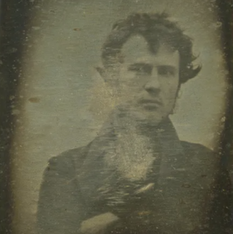
Robert Cornelius Self Portrait 1939
|

Hippolyte Bayard 1840
|
These images are very similar in quality because some parts of the images are not very visible and look like they had been scratched away. The Hippolyte Bayard image was taken by using silver chloride paper being exposed to light to take a picture. In the Hippolyte Bayard self portrait there is only a hat in the background whereas in the Robert Cornelius self portrait there is nothing in the background. I think these self portraits are different colours because of the way that they were preserved. For example I think the Hippolyte Bayard self portrait was kept in a safe place like a box or a safe while the Robert Cornelius image was left in an open area and wasn’t well kept. I think the Robert Cornelius image was only a picture of his head and shoulders because he was too close to the camera. I think in the Hippolyte Bayard image he was pretending to be dead so he was laying down and had his eyes closed to imitate a corpse. These images are presented in different ways because Robert Cornelius was trying to look professional because it would be the worlds first photographic portrait but Hippolyte Bayard was trying to make the worlds first portrait have meaning. I prefer the Robert Cornelius self portrait because it is a much more average and simple portrait. If I were able to ask one of the photographers a question I would ask Robert Cornelius how he took his self portrait. I found out that Robert Cornelius took his self portrait in the back of his family shop. Robert Cornelius was a lamp manufacturer as well as an amateur chemist. Hippolyte Bayard was a civil servant.
The first photo I saw:
I can not remember the first time I saw a photo but I can remember another photo that I saw recently it was a picture of a man being punched in the face by another person with a truck painted on his hand the man being punched had a painting of a red car on his jaw and in the corner it said 'stop the violence don't drink and drive'. The background was completely black and there were only a few shadows on the faces. I would describe the image as inspiring, colourful, memorable, unique, creative, helpful, considerate, aesthetically pleasing and meaningful.
Photo Evaluation:
|
|
The photos I created were difficult to make because we had to move a lot of things around so that the focus of the image looked better. It was somewhat challenging to recreate this image because we created a different background. I decide to make it have a different background because the image would look more interesting because we were not able to paint cars on our hands and faces. My version of the image looks quite similar to the original image because we kept the original concept of the image.
|


Photo Recreation Homework:
This is the original image it is a picture of me and my younger sister when we were younger.
|
This is the recreated version of the original image and I think that it is very different because in the original image we both have really short hair and in the recreated version we both have really long hair. I really like this image because it shows how much my sister and I have grown since the original image was taken.
|
Nico Froe research:


Nico Froe takes environmental portraits these are portraits of people and their surroundings to make a really nice portrait. Nico frames the images by trying to make the image mostly focused on the person and some elements of the background. The background is an important part of photography because it gives the image context, meaning and contrast. Nico Froe photographs strangers from in and around South London that catch his interest (For example most of the people in his photos are wearing unusual clothing for the settings and are particularly interesting). I find a lot of Nico’s photos really interesting because they are pretty random but they seem oddly uniform in the way that there is an order to most of his images. An example of this is the image of a child in a restaurant with a mosaic pattern, the pattern makes the image seem like it is very orderly but it also makes it seem random and casual because the coloured tiles are arranged in a random order making it seem more natural.
Nico Froe Workshop Environmental portraits:


I like these images because they show the staff, the students and the surroundings of the school. In my images there are a lot of bright and vibrant colours that contrast with the very dull white colour of the walls. The images also show what people at the school do daily and how they feel about their environment. I think that my images seem somewhat similar to Nico Froe's images but they also feel as though they are drastically different. I think that this is because a lot of these images were intentionally made whereas, Nico's images seem like they are natural, and not forced. I feel like my images share similarities with Nico's work because they both depict people in their daily lives but not all of them seem very natural because I used low camera angles when taking these images. If I were to do this again I would try to avoid using low angles when taking the images and instead take them from eye level or a higher angle and I would try to be a bit closer to the subject of the images.
Environmental portraits homework:


These images are really nice in my opinion because the way that the sun was positioned in the sky made the image look really colourful. My favourite image is the image that I am walking near some trees and the sun was shining through the leaves.
Tyler Mitchell Research:


Tyler Mitchell wants to take pictures of black people having a good time and relaxing to show that the media is wrong in how they have been portrayed. These pictures are important because it shows that people shouldn’t be judged by the colour of their skin. People don’t usually see images like these because they have been denied by the media and he wants freedom for these images. He takes these photos to show that black people are the same as anyone else. His images are all very colourful because he was inspired by the bright vibrant colours in Cuba. Tyler Mitchell wanted to recreate the memories he had from his childhood because he wanted to make sure that he never forgot those memories and could share them with everyone that is interested. It is important for Tyler Mitchell to work collaboratively with the people in his images because he needs them to listen to him otherwise the image won’t look very nice. Tyler Mitchell's images are influenced by fashion because it would make the images more interesting and appealing to the average person. My personal favourite image is the one with the boy and the hula-hoop because of how vibrant the blue and purple are.
My photos inspired by Tyler Mitchell:


All of my images were really nice in my opinion because they all remind me of Tyler Mitchell's images because of all of the vibrant colours of the grass and the sky in the background of my images. My images are all eye catching because the background colours make the subject stand out because the grey, black and blue contrasts with the green grass and the yellow school buildings.
|
This image reminds me of Tyler Mitchell's images because the person in my image is young and relaxed this makes people feel like the subject is more relatable. The bright colours in this image are reminiscent of Tyler Mitchells images because of the interesting colours that make the images all look eye catching and joyful.
|
The photography exhibition:


These images are the pictures that I took on our photography trip. In my opinion they are mostly pretty good however some of them were really blurry because I had to take pictures of all the images I found interesting in a small amount of time. I really enjoyed this trip because it was really interesting to see all the different styles of photography throughout time and how photography has changed since the first photo ever. I enjoyed taking pictures of all the different photos in the galleries and the areas outside of the gallery.
Elements of portraiture:


The images are based around the different types of portraits and I think that they are pretty good in my opinion because the images all fit the type of image that they are supposed to be. For example, The police mugshot photo has a sort of sad mood. I feel that these images are framed really well because the subject is in the centre of the image and the background stays mostly in the frame. The angle in most of the images are mostly straight and on eye level, however the family portrait inspired image was taken from a slightly lower angle. I could improve these images by using different angles in some of them, but it could make the images look worse because it may not fit the type of image I want to take. An example of this would be a mugshot from a low angle, it wouldn’t fit the scenario that the image is taken in. The purpose of this task was to explore different types of portraiture and how they are different. For example, in a family portrait you can smile and laugh but in a passport photo you have to sit still with a straight face. There are quite a few different elements of portraiture like facial expression, pose, clothing and background.
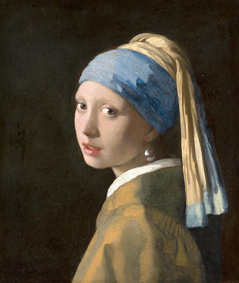
The similarities and differences between photographic portraits and painted portraits:

Johannes Vermeer 'Girl reading a Letter at an Open Window', 1657-1659
|

Tom Hunter 'Woman Reading Possession Order' 1997
|
In these two pieces there are quite a few similarities. For example, all of the lighting is coming from the window and there is a woman holding a letter in both of them. However, there are also some differences. One of them being that one of them was painted and the other was photographed. I think Tom Hunter wanted to recreate this painting because he wanted to demonstrate how similar art and photography are and that they are also different in many ways. These pieces also share a few visual elements. Some of these are that the lines and shapes are similar and roughly in the same places. I noticed that these two pieces are pretty different in terms of colour because in the first piece most of the colours look dull and worn out, but in the second image the colours are bright and colourful. The artist also made the piece different from the original painting by putting a shelf with speakers in the background, swapping the fruit on the bed with a baby and not putting any curtains in the final image.
My recreation of paintings:

|
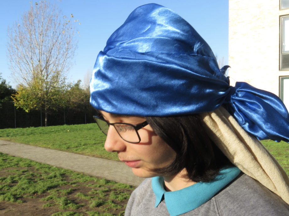
|
In this portrait my partner and I tried to recreate the famous painting of the girl with a pearl earring however it didn't work very well because we couldn’t find a dark background so we decided to make the background more interesting and take the picture from a different angle than the portrait. In my opinion the image isn't the best but it also isn't horrible, so I think think I could have done better but i had to use had I could.
Refined painting recreations:
|
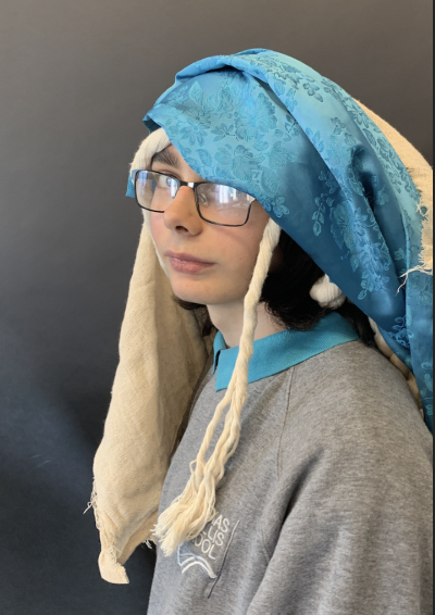
|
I think that these photos are very similar and that this image is better than the first version that I took because the background is closer to the colour of the original than the other photo that i took. The colours in the images look roughly the same and this time when I took the image it was at the same angle and level as the original painting, which makes it better in my opinion.
Cyanotype research:
Making a cyanotype is another way of printing images. To make a cyanotype you need an image printed onto a sheet of thin clear plastic over a piece of light sensitive paper and put it under a UV light or leave it outside in the sun. It is usually left there for around 20 minutes, however it comes out in a blue hue. The process of cyanotype was invented in 1842 by John Herschel. The process of cyanotype is 170 years old.
Photogram artist homework:


|
This image reminds me of someone rolling dice because there are multiple squares in different orientations. I think that the purpose of this image is to show how words can hurt. I think this because there are a lot of squares with letters on them surrounding a gun. If that is the message I think that this image conveys it very well because of the darkness surrounding the objects in the image. I think that it was a good idea fo the artist to use photograms because the contrast between light and dark give photograms a somewhat ominous feel.
|
Lighting Workshop:
KEY LIGHT- Main light.
FILAMENT LAMP- Large light, gets hot quickly.
SOFT BOX- confines light from an artificial source into a wire framed box.
DIFFUSION- Layer of of translucent cloth used to make light less harsh.
LED LIGHTS- Easier to work with, don’t get as hot. Can change the intensity on the arrows on the back. You can clip gels (coloured acetate) with bulldog clips to change the colour of the light.
TWO TONING- Using two different colour gels on one subject.(For darker skin tones- best to use warm tones such as orange.)
BARN DOORS- Flaps on the side of the LED lights used to manipulate the light. Can be unscrewed and moved.
2 POINT LIGHT SYSTEM- Using 2 lights. White reflects the light. If you had a white wall, the light and shadows is harder to control. Black absorbs light. If you had a black background, it will absorb the light. It is easier to make make shadows with a black background.
GREEN BACKGROUND- Used for green screening key framing, can replace the green with anything.
SPEEDLIGHT- Is not a continuous light. It flashes when controlled by a trigger.
A STOP OF LIGHT- A stop is doubling or halving of the amount of light let in when taking a photo.

|
This picture was taken using what I had learned about lighting from the workshop. In my opinion it isn’t a bad photo but I was a bit disappointed because i wanted to use gels but the LED lights weren’t working so I couldn’t use the gels. If I were to do this again I would have tried out different lighting angles and experimented with different types of lights because this image could have been a lot better if I had spent more time on it instead of coming up with an idea on the spot. I think that the reason this image didn’t look the way I was hoping that it would was that I didn’t think about the composure of the image or the angles of the final product.
|
Self portraiture:
Lee Friedlander:


I like these portraits because they are simple yet appealing. These pictures look like they were taken in the 1950's or 1960's because the buildings look older and they are in black and white, which makes me think that these were taken on an old film camera. in the picture with the lightbulb it reminds me of threshold concept 2 'Photography is the capturing of light, a camera is optional.
|
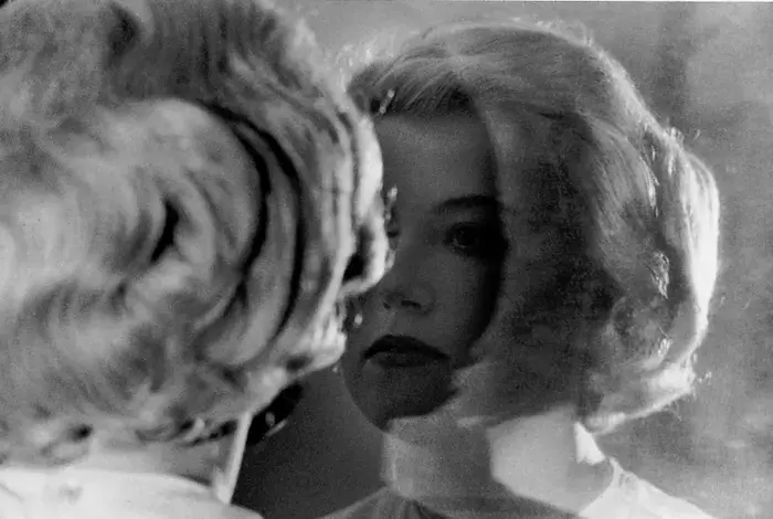
I like this image because you can partially see his face and the background from the reflection in the mirror. The trophy is behind the window and the artist has positioned himself so that it looks like he is holding the trophy in his hands. It also seems like the trophy acts like a divider between light and dark as there is a lot of shadow on one side of the trophy and really bright lighting on the other side of the trophy which gives the image a lot of contrast between the light and the shadows.
|

|


I like these images because two of the images was taken at an eye level and the other two were taken from a lower angle looking upwards towards the ceiling and the subject. Out of all of these images I like the one on the far right the most because there is a glass ceiling letting light in so at the bottom there is a lot of shadow on me because of the light from the roof creating a large contrast between the light and the shadows in the final image.
Rankin - Destroy Project:


I think these images are really unique and interesting. They all have a different sort of style in the way that they are represented. It is really interesting to me because they were destroyed by the people in the images to show how they think of themselves, some of them are supposed to be funny and others look like they are meant to represent power and confidence. In the videos he talks a lot about how editing the pictures give the models in the picture a chance to show people how they see themselves and how they want to be seen and telling the truth within the lie that is model photography.
My destroyed portraits:
Photopea distorted images:


I like these images because I edited them in a wavy and pixelated style so it makes them look interesting and unconventional. The middle left image took me a longer amount of time to distort because i had to use the liquify tool to make every ripple shown in the image by hand, but it was worth it in the end because in my opinion it is the best image out of all of the ones that I edited on photopea. The image with the ripples looks appealing in my opinion because the waves are subtle. The purpose of these images was for me to experiment with different types of distortion and editing.

Photogram edited image:

|
This image is kind of strange in my opinion because in the foreground you can barely see random lines. while in the background there is a picture of me however, I think that the image isn’t as good as I had hoped it would be because the image in the background isn't as bright as i had thought it would be. The purpose of this image is to show how simple it is to make photograms. In my opinion this image is very effective at showing the simplicity of photograms because there isn't a lot of items in the image so you can see the image with very few obstructions.
|
Cut up portrait printed in two colours:
|
Out of all of the different ways of destroying our self portraits, this way was my favourite because you were able to cut a picture of yourself into different pieces and photocopy them and then you would photocopy the same image onto the original image but upside down and in a different colour that contrasts with the original. The low angle in this image makes the image look better when it is mirrored as it makes the image look like two images splitting apart.
|
|
Artist research Cindy Sherman:


- Cindy Sherman's portraits are usually in black and white.
- She usually takes pictures in front of large buildings.
- In quite a few of her images she uses low angles but in others she takes them at eye level. Very few of her images are taken from a high angle.
- She uses different types of clothing to make all of her images different from the others.
- She experiments with different colours in her images, sometimes they are black and white, other times they are bright and colourful.
- She likes to have contrasting styles in her images. For example she will have one image themed around sadness and depression and the she will take others themed around fun and laughter.
- She uses various different backgrounds in her images.
- She is always doing something in the images, she never stands still, there is always expression in her images.
Cindy Sherman image evaluation:
|
In this image Cindy Sherman is looking at her reflection in the mirror, she also appears to be frustrated about something. This portrait may have been taken to represent how people can get angry at their appearances. If that is the purpose of the image then it does a very good job of conveying that point without being too dramatic or complex, it also seems like it may have been expressing that people's appearing may not reflect their emotions. The image is called 'vanity mirror', in my opinion this title suits the image very well because the word vanity has two meanings: excessive pride about their looks and futile or worthless. This fits the image well as a mirror is usually used to admire oneself but the dual meaning of vanity shows that this image might be used to show that your feelings, whether they are feelings of worthlessness or feelings of joy, can affect how you see yourself.
|
Artist Inspired Self Portraits Homework:


In my opinion these images are relatively simple and nice but they were somewhat repetitive as I began to run out of ideas about halfway through so they all look similar. My favourite images are the photos of me hugging my dog because it adds more depth to the image because you can see more emotion in my face instead of all of the images looking really serious and dull. If I were to take these images again I would try to experiment with different levels of brightness and exposure to make the images look less like all of the other photos i took for this homework.
ziqianqian artist evaluation:


In my opinion these images are really creative and simple. They are really colourful, but not too bright, I personally like how easy it is to distinguish the background from the foreground using contrasting colours. The background is almost always one dark, flat colour while the foreground has brighter colours. Most of the props that she uses are all different types of plants and different aspects of nature, she mixes natural portraiture with minimalistic surroundings to make a really interesting type of photos that are clearly deliberate but also have a sense of natural structure and order. In all of these images she has clearly spent a long time creating the background and foreground.

|
In this image there is a mirror showing a reflection of ziqianqian holding an apple behind her back with a hole shaped object in the foreground to draw attention to the subject (the apple). This photo may represent people working towards their goals as it reminds me of the saying 'There is always a light at the end of the tunnel', the apple may represent a goal and the hole shaped object may represent the pathway to your aspirations. She composed this entire image around the apple so she put it at the centre of the image and she decided to draw attention to it using leading lines in the form of the opening in front of the apple. Ziqianqian broke the norms of self portraiture by not showing her face in any of her portraits, which doesn’t normally happen but it can still be considered self portraiture as there aren't any rules in place to dictate whether or not you have to show your face in order for it to be considered a self portrait.
|
Artist inspired portraits (ziqianqian):


In these photos I can see myself in the mirror, however because the mirrors are scratched my reflection looks very blurry and unclear and I like that because it doesn't show very intricate detail so it is simple yet effective. In these images I tried to make my face less visible and I think that it was a good choice. In my opinion these images aren’t very similar to ziqianqian's portraits because of how she uses a minimalistic setup with a single colour background, but in my images there is quite a lot going on and there aren’t many props in most of the images, however they are fundamentally similar in the way that they are all centred around reflection and portraiture. If I were to retake these pictures I would get a less scratched mirror and take some with a flat, plain background with some studio lights to make them more interesting, I would also use more props in the images because there wasn't quite enough detail in these images. I should have taken more pictures and made them more appealing.
Mirror portraits:


I didn't get many images in this lesson because the flash on the camera was so bright that I wasn’t visible, so I had to take a lot of images to see if I could get some where I was visible. My personal favourite out of all of the images I took this lesson is the one in the centre because it almost covers the entire mirror but it only covers the centre of the mirror covering my face but it is still a self portrait because you can see parts of me in the mirror. In these images there isn’t a lot of colour because the background is a plain white table and the laptop holding up the mirror is black and silver, the only interesting colours in these images are in the mirror.
Experimenting With Portraiture Homework :


For this homework I saw my led light in my room and decided to try experimenting with light, angles and reflections. I think that these images came out really nice and I like that I used lighting and reflections to make the images more colourful and interesting. I challenged myself to only use one light and see what images I could create with it, I took quite a long time to think of how I could make many different images using one light. My favourite part about this homework was that it gave me creative freedom to experiment with different ways of taking photos and different ways of using props to make the image more interesting. In my opinion the images with the purple coloured light are my favourite images because it adds a very prominent colour to the image and the light bounces off of the background, giving the images more depth. I liked using light to make portraits because the colourful glow makes the images more eye catching.
Photography Mock Plan:
For my photography mock I want to experiment with light and reflections as I enjoyed experimenting with the studio lights and with the effects of reflections. I am thinking of making a series of images using different kinds of lights and mirrors, the end goal of this for me is to produce six or more images that contrast with the others to create some interesting photographs. For example, one image could be a reflected portrait with a bright red light and one of the others could be the same but it would be facing in the opposite direction with a soft blue light. I really enjoy making images with lights and mirrors because it makes me feel like i have more control over the images I take because I can control the colour of the lights, where the lights are positioned, where the subject is positioned, where the mirror/ mirrors are and the colour of the backdrop. This type of photography feels really extraordinary to me because most other genres of photography are about natural elements of the world (which I also really enjoy) whereas with studio lights and mirrors they give you more control of the final outcome, which makes the final product feel like there was less luck required and more effort is needed in order to make a photo that looks appealing. I think that this project will be very successful and interesting because there will be a lot of different types of photography in the pictures I am going to make. I plan to make sets of 2 images that contrast with each other. The 1st will be orange and green light, the 2nd will be blue and orange, the 3rd will be yellow and purple.


GCSE mock analysing (Cindy Sherman):
|
This image gives me the impression that this person is trying to convey how depression feels and that she is trying to spread the message that it is difficult for people to live happy lives and how difficult it is to escape feelings of depression. The image gives me this impression because she is in the corner of a room with cracked/ crumbling walls that act as leading lines that draw your attention to the subject of the image. The lighting also acts in a way that diverts your attention away from the other aspects of the image and ensures that your focus is completely on the person in the image. This photograph conveys a feeling of sadness and loneliness because the monotone colour scheme makes it seem dark and dull. However, I am not exactly sure that this image is a truthful depiction of the subject because Cindy Sherman is well known due to the fact that she is depicted as almost entirely differently in each of her images. For example, some of her images are depicted as happy and joyful with a big smile on her face whereas, in other images that she has taken she is shown with an expression that suggests that she is in a bad mood. Overall, in my opinion this image conveys the message of the struggle of depression really well because it reminds me of everything I have heard about it.
|

|
Portraiture final piece:


For all of these images I used editing applications like photopea and pixlr because they are easier to use than photoshop and can still look very good. my favourites of these images are the blue and the blue and orange images These images all look good because they were all originally really vibrant and colourful but I put the same images below them but with an x-ray like filter and then i used the cutout tool to make the bottom image come through and give the final version a sort of dark undertone.


These are the images that show the process I went through to edit and create most of these images.
