Introduction:
I have a somewhat unusual relationship with the natural world because I enjoy going on walks in the woods or in the fields with my family but sometimes I wont have a very good time because my hay fever prevents me from doing these sorts of things for too long in the spring and summer seasons but I still enjoy the natural world. If I were to choose a place to take photos of a landscape I would probably go to the fields in Blackheath, Oxleas woods or Sutcliffe park because they all have really nice natural landscapes. I feel that people take pictures of the natural world because it is captivating and also peaceful. Photographs, in my opinion, can help us to change the way that we see things because some people may dislike large cities because they don't appeal to them but they may agree that they look beautiful at night because they may have seen pictures of it.
My Ideal Landscape:


Lanscape Homework:


I took these images in and around kidbrooke and blackheath as i live in that general area. I think that these images are quite nice as most of them are vibrant and colourful which catches a viewers attention causing them to admire them longer. If I were to do this task again I would try to take more vibrant photos because a few of them look pretty dull and boring as they lack a specific subject.
What Is a Landscape Photo:
-When I hear the word landscape I think of a wide open field with a bright sunset and some trees dotted around.
-The first 10 words that come to mind when I hear the word landscape are:
nature, trees, animals, plants, flowers, buildings, lights, forest, outdoors and sunset.
-When I search the word 'landscape' the resulting pictures are bright, sunny, full of plants and wildlife and heavily edited.
-My ideal landscape would be a forest with a river and a bright sunset / sunrise barely visible behind the trees.
-The landscape outside of the classroom is bright and sunny with a lot of trees, benches and hills.
- I have taken a lot of landscape pictures before but there wasn’t much variety between them as they were all mostly pictures of nature, ponds, rivers and monuments. I usually took pictures of them just because I thought the area looked really nice and inspiring without any other intentions.
The Idea of Landscapes:
|
-The artist has chosen to attempt to capture as much of the landscape as possible in one frame.
-There most likely isn't much that has been excluded from the frame as it has captured a large section of the surrounding area. -The artist might live near the area in the photo so may feel a certain connection to this landscape. -This picture seems to have been taken from an eye level viewpoint. -We are positioned very close to the landscape in this image but it also reaches very far away so it creates a sense of distance between the landscape and the viewer. -This image makes the viewer feel somewhat separated and alienated from the landscape it also feels like it is a somewhat hostile place. |

Roger Fenton - The Valley of the Shadow of Death 1855
|

Richard Prince - untitled (cowboy) 1989
|
-The artist has decided to include a man riding a horse past the clouds in a desert like landscape. The other parts of the landscape may not have been included in this image (like mountains or ditches etc).
-The artist may not have any connection to this landscape as you can't really tell where it is, although in the image the man seems to be on a mountain because when someone is on flat ground you can normally see the land stretching behind them towards the horizon, but in this image there looks to only be a small amount of land behind him. -The vantage point seems to be either from a high point as you can see the sky behind him very easily. -We may be pretty far from the landscape in this image because the blurriness makes it seem like the image was taken through a zoomed in lens. -This image makes the viewer feel a sense of freedom as well as inspiration as the man in the photo seems to be having a good time without having to follow any rules or expectation. |
Back To The Future: Constructed Seascapes:

Gustave Le Gray - The Great Wave, 1857.
|
This image describes a constructed seascape made of two different pictures (one of the sky and one of the sea exposed on the same piece of paper) in black and white. This picture is similar to the Dafna Talmor image because in both of them there are some dark and almost murky colours in the water and in the backgrounds. There are a few differences between these images. For example, there is a dark ring around the edge, almost like a vignette around this image giving it a darker undertone whereas in the other image there are brighter colours in the centre and grey charred-looking edges. If I had to describe this picture I would say that it is: unique, old, interesting and unusual. I would probably prefer to live in this landscape rather than the Dafna Talmor landscape because it looks, in an odd way, kind of peaceful and intriguing to me, whereas the other landscape looks confusing, unusual and somewhat unsafe.
|
|
This image shows a seascape that has been taken apart and reassembled to make a constructed seascape that looks charred on the edges. These pictures are similar because they both have some dark colours in the water and in the backgrounds. There are a few differences in these two images. An example of this would be that one of the images is in black and white, while the other image is in complete colour. If I had to describe this image I would say that it is: sporadic, random, disorganised, unusual and confusing. If I had to choose which landscape I would rather live in for a long time I would choose to live in the Great Wave landscape as it seems more interesting to me because of how much room there is to explore and move around without being disturbed by anyone, whilst in this landscape the area seems kind of dangerous and easy to get lost in.
|

Dafna Talmor - From the Constructed Landscapes II series
|
Gustave Le Gray Research:
- The great wave was taken in 1857 from the Mediterranean coast near Montpellier
- He took the picture because the clouds disappeared on the horizon where they met the sea.
- The image was meant to represent the join between the two negatives.
- It could also represent coulombs law that opposites attract.
- The difference between the sea and the sky made the final print of the image have the perfect tonal balance.
- He believed that the image gave a more truthful representation of how the eye perceives nature.
Dafna Talmor Research:
- Dafna Talmor uses the collage method to make constructed landscapes.
- She also uses montaged colour negatives from different areas.
- She merges the landscapes using a method called 'slicing and splicing'.
- Her work references the early process of pictorials called 'combination printing'.
- She also uses montaged colour negatives from different areas.
- She merges the landscapes using a method called 'slicing and splicing'.
- Her work references the early process of pictorials called 'combination printing'.
Dafne Talmor and Gustave Le Gray Similarities:
- They both reference the idea of positives and negatives.
- Their images have a deeper meanings/ motives behind them.
- They both reference the idea of opposites.
- They both used more than one image to create their pictures.
- Their images have a deeper meanings/ motives behind them.
- They both reference the idea of opposites.
- They both used more than one image to create their pictures.
Trip Documentation:


The display was really neat and tidy which really made it feel really professional.My personal favourite photographer that had their work presented in the exhibition was John Davies because his work is not only beautiful but it also has a meaningful message behind it making his point through different mediums than others would think to. The message he promotes is that the trees need to be preserved, not destroyed in order to create more housing when there is already an excess of housing. The work of John Davies caught my eye when I was exploring the gallery because it looked amazing even though it was only in black and white, it felt as if the work brought colour to the plain white walls.The theme of the exhibition was constructed landscapes which is the style of photography I am currently studying. Overall, I actually really enjoyed the gallery because there was a lot of different kinds of landscape images from photographers with different ideas about photography.

Minimalist Landscapes:
Artist Research Task:

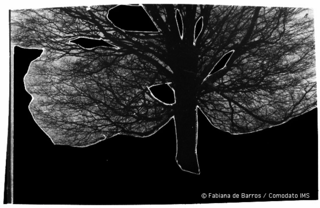
geraldo de barros from the series sobras 1996
|
In this image I can see a large tree as the subject of the image but there isn't anything else in the image other than the tree and its leaves. I find the fact that the tree seems to be floating surprising because most images have more than one object in them. When I look at this picture I feel a sense of focus because of the fact that the artist removed all distractions from the image. If I were to attempt to create an image like this i would take a photograph of a tree and cut it out and then digitally scan it. I think this artist has removed parts of this image to clearly show that the tree is the subject.
|
|
In this image I can tell that it is meant to be a landscape but there isn't much else in the image. I find the fact that the bush is made out of very simple shapes very surprising. When I look at this picture I feel a sense of inspiration because the artist made something that i can recognise as a landscape without using an actual image of a landscape. If I were to attempt to create an image like this i would cut up pieces of black paper and stick them on white paper arranged to look like a landscape and then digitally scan it. I think this artist has removed parts of this image to show that you don't need to be amazing at something to get your point across.
|

liz nielsen - gardening with you, 2020 photogram
|
If I had to choose an image that I prefer out of these two I would choose the Liz Nielson image because it is a very simple image that is very effective at making a point and also feels like it would be challenging to make an image in this style because of how the lines appear to be random but fall perfectly in place in order to create an image, and I personally believe that it would take a lot of skill and practice to make an image anywhere near this good.
Minimalist Landscapes:

|
In this image I think I under exposed it so some parts of it were very fuzzy and didn’t come out as I was expecting it to. My fist impression of this image is that it looks like it was rushed because of how fuzzy it is. This image, in my opinion, isn't bad but it is nowhere near as good as it could have been. The image shows a tree and some buildings in the background. The original image was taken in blackheath near the summer fair. To me this image has a certain effect, it could be interpreted as a way of showing the simplicity of the world as the shapes are relatively simple and there are only two colours.
|
The Original Image: |

|
Artist Research: Hiroshi Sugimoto


In these photos it is clear that Hiroshi Sugimoto has a very interesting and unique style that translate well into his other projects. The black and white colour scheme in his work stops the viewer from getting distracted by other irrelevant details so that they can focus on the subject of the image. All of his images share a similarity with each other, the subject of all of the images are buildings. These photos remind me of the intro to a black and white movie. A few of these images have leading lines that brings your attention to the subject but some of them don't need any leading lines because they are the only thing in the image. The photographer has captured the play of light in these images because the images are black and white so it is easier to see where the shadows fall. These pictures differ from how we see buildings in our daily lives because we see them in colour and in focus whereas in these images the buildings are blurred and in black and white. The most interesting parts of these images to me are the different kinds of lines that make up the buildings, some are straight and sharp, whilst the others are soft and rounded. Hiroshi Sugimoto's method he uses to make these photos is really difficult to get good at doing consistently showing that he has an amazing amount of skill and experience. To take his blurry images he uses a 19th century large format camera. "To him, photography is the medium for exploring the permanence hidden behind the transient nature of all things" - A quote from a Forbes article about Hiroshi Sugimoto. Before I did this research I thought that Hiroshi Sugimoto was just another photographer that I was going to write about and never think about again but because of this research I had the chance to explore another photographers work and his reason for photography and his reason for photography is really inspiring. “That’s the character of the medium of photography – it can deal with time,” he notes. “It is a medium for recording time and history, a quality I use in my work. For me, photography is a kind of time machine. I can travel back in history and confront it with the future. I can almost bring back the dead to our world. That’s the magic of photography.” - A quote directly from Hiroshi himself explaining why he enjoys photography.
My Response To Hiroshi Sugimoto:


I couldn't take 20 pictures because almost every time I tried to take a blurred picture the screen would turn white and there wouldn't be an image even when i decreased their brightness’s, But overall I think that these images a pretty good in their own way because they are overexposed but the shadows in them create a good contrast between blinding light and dark shadows. If I had to say one thing about these images I would say that overall they are a good first attempt at recreating Hiroshi Sugimoto's style. All of the images have lines that lead you eyes to the centre and they are all contain sharp straight lines similar to those in Hiroshi's work. These images show buildings and metal structures. These pictures don't give a fully truthful depiction of these objects because in the images the overexposed white makes them look really bright when in reality the buildings are dark yellow and the stairs are a silver colour. The reason this photograph was taken was to see how difficult it would be to replicate Hiroshi's style of photography and how to improve on it next time we attempt it.
Blurred Landscapes experiments:


To take these images me and my dad walked through oxleys woods, Greenwich and the Thames River walk after school as it isn't too far away from where we live. I made these images black and white to make them somewhat resemble Hiroshi Sugimoto's style as I find it really captivating and interesting.
If I had to choose one image I like the most I would choose the one the picture of the Thames gate because it has many different lines and shapes that compliment each other to make a interestingly shaped structure.
If I had to choose one image I like the most I would choose the one the picture of the Thames gate because it has many different lines and shapes that compliment each other to make a interestingly shaped structure.
Slide Evaluation:


I think I did a pretty good job when creating these slides because I took my time when making them and I practiced on some older ones beforehand so i understood what I need to do when making my actual slides. I am happy with how they turned out but unfortunately they don’t project properly as the are portrait when they are supposed to be landscape so the next ones that I will make will be landscape as opposed to being portrait. I would also have an assortment of different types of photos for my slides (e.g. black and white, blurry, in colour, urban and rural). To create these slides I used images that have many different colours some vibrant and some dull but i used coloured acetate that I thought compliment the colours in the original images to make some really vibrant and colourful slides. For one of the slides there is a lot of bright colours so i decided to use a dark green piece of acetate and the others had quite a lot of shadows so i decided to use really brightly coloured acetate in order to create more contrast. in the slide with the sunset I decided to try and use pink acetate to try and allude to how the sky sometimes turns pink when the sun is setting and it turned out really well in my opinion. for the picture of the lake i decided to use bright yellow acetate to make it look as though the light from the sun had cut through the slide and make it seem like it is coming out of the slide. And finally, for the really vibrant image with the building in the background i decided to use a darker green to make it look as though the grass has attempted to bridge across the lake to the other side.
|
|
In this video Dafna Talmor talks about why she creates constructed landscapes. Her reason being that she wants to create a landscape that creates the idea of perfection and ideality. She wants to strip away the personal connotations and connections people may have towards the slides and create something that can be appreciated universally. In her slides she tries top implement many different viewpoints and perspectives into one frame to unify all the different views. She also notes that she can often feel as though she is overwhelmed by the pure amount of beautiful pictures she could take which makes her multi-perspective images feel less overwhelming as it is almost like she has captured the entire landscape in one frame.
|
Drafts Video and Evaluation:
|
Drafts from Dionne Lee on Vimeo. |
In the video the women shows all of the pieces she has made to represent her final piece for her project. She shows how she uses physical images to create a constructed landscape that looks interesting. When I recreate this technique I want to use an assortment of pictures that share similarities with one another unlike how the woman in the video who uses all different kinds of images.
|
Antti Laitinen Artist Research:
In Laitinen's images he take pictures of trees and cuts out the holes in the tree branches. This image invokes a strong sense of natural competition because it looks as though two sides the tree is being destroyed. But this could be used to represent the idea of man vs nature as it looks as though there are bullet holes in the trees branches, overall I believe that his images all give the viewer an idea of how the world is dominated by the idea of competition. In theses images I can see that the artist makes use of contrast to bring your eyes directly to the subject of the image without being distracted by minor details. He also uses a lot of contrast between light and dark colors like white and black or white and brown. To make these images he takes a picture of a tree and uses the liquify effect to make it seem as though the tree branches have grown in a circular shape. If I were to try to make images like these I would use photoshop or photopea to make the images. If I found this too difficult I would experiment with other ways of emulating the effect these images have (e.g. painting on the images, drawing on the images or gluing ripped paper to the images). Hopefully it would be similar but not an exact copy as I don't want to copy and plagiarise another artists effort filled work, I admire his work and want to experiment with his style and learn from the experience.
A collection of Antti Laitinen images:


|
This image is my favourite because the trees look like they have grown in an odd way creating a sort of optical illusion that make the tree branches look like they have grown in a circular shape. This image is mostly natural as it is showing how strange the natural world can be. However, it could also represent that there is a substantial amount of competition within the world, I think this is represented by the fact that the trees seem to be bending to the will of the environment. To make this Laitinen would have had to spend a while editing the images to make the look the best that they can look. This photograph reminds me of the winter time as the land often gets coated in a layer of snow.
|

|
Mind Map For How I Plan To Respond To Antti Laitinens Work:

My Response To Antti Laitinens Work:


I tried to recreate the style of antti Laitinen but mix in my own style creating something that is similar but not an exact copy but I think that they look too similar to my final piece for face value so I should make quite a few changes to my work as I progress with this task. Unfortunately I was not able to edit all of them and some of them i was unable to upload because they were in the wrong format. However I am happy with the final product but I do believe that I tried to do too many things at once which caused me to run out of time to edit these images even though I edited and took them over the course of multiple days. If I were to do this again I would try to lighten the workload so that the tasks do not become overwhelmingly stressful for me to complete in the future. I think that, whilst they do look pretty good, next time I should study how he made this effect in his work and attempt that same method because they look very different to Antti Laitinens photos. I think that Antti used a liquify tool to make them look like they have grown in an irregular and circular manner. I also need to add more spots/ holes in the images because in Anttis' images he usually has more than one to make the illusion of the holes more convincing to the viewer. I need to study how to get a similar effect to Anttis' so that I can make a high quality response to his work so that I can make an impressive final piece. In conclusion I am happy with how the images turned out because they may be considered bad but now I understand what I need to do and change for my images to become more similar to how I want them to be but I think that they I would also be happy as long as I can make an idea that I have work well as a final response piece. I think that each time I am taking photos I should try to take more photos so that I am able to select the ones that I like the most to put on my website.
Process Of Making The Images:


My Decisions and How I Plan To Expand Upon My Ideas:
I have decided to take inspiration from Antti Laitinen's work but deviate from it by incorporating my own style that I have previously used in my Face Value project to create similarities that gives my work it own distinct look. I want to try using different effects in my images but still make them all look somewhat similar to one another. Next time I do some experimentation I might try to use different filters instead of a neon glow in all of them, just to give my images some more depth and complexity. I might also take some images that differ from my previous experiment (e.g. take some pictures of more unnatural objects such as buildings and technology). I am planning on trying out inverted versions to see if it looks better than the ones that I have taken before I may even use images with people in them to attempt to make an image that gives the viewer a feeling of exploration just by looking at the images. I want to make my images powerful, I want to make images that invoke a strong sense of emotion and feeling in order to create something that can create enjoyable interactions and interactions, which is why I chose to respond to Laitinen because his images made me feel a strong sense of curiosity. I want to try and put another images in the cutout of my images to make it look like some kind of portal or gateway but if I think that my original images look better then I will stick to using one image.
More Experimentation Inspired by Laitinen:


This was my first time experimenting with oppositely edited images and I think that they worked very well because they have a very different look about them from one another without looking too different so that you can tell that the images are meant to be partnered together.
My response to Antti Laitinen's work (2):


In these picture I believe that I have captured the kind of landscape that would give a similar effect to Antti"s work but would be different so as to avoid plagiarism . For the next time that I do experimentation I might try to take pictures of some things that don't really match Antti's style so that i can see what kind of landscape images work best with this style (e.g. urban landscapes, rural landscapes or a combination of the two.) When I edit these images I think that they will turn out beautifully because in a lot of these images there are glares from how vibrant and bright the sun is. There will also be quite a lot of contrast once I have completely edited these images because most of them are really brightly coloured and in the style that I am using there are usually dark holes with neon-like colours on the inside of the holes. Overall I really like these images because of how vibrant they are.
Experimenting with my response photos:


My intentions for these images were to only make 1 image to accompany the original version of the but instead I have made two edited versions of the original image that look like they are all similar yet different. At first I only wanted to have two images together (the original and one edited image) but I decided that I could challenge myself even more and try to make three to see if I liked the inverted edits more or the original edits more but I found that I don't favour one more than the other and that I liked both ways of editing the images. So in the end I decided that I wanted to incorporate all three images (the original, original edit and the inverted edit) into my project and when I am finished with the experimentation I want to experiment with how I want to lay out the three images for the display (e.g. in a triangle, a vertical line or a horizontal line). I also want to decide how I want them displayed(e.g. in a frame, in a book, hanging from something, etc).
The Process Of Making My Images:


To make images in this specific style I put the image into photopea and go to the filter option and press on the filter library. Then once I have gotten into the filter library I select the glowing edges filter and screenshot the image and I DO NOT overwrite the original image. Then I put the glowing image in the background layer and then I put the original image over the top of the glowing image and I then use the cutout tool to make holes in the original image and this makes it look like there are holes in the image or some kind of x-ray lens was put over the original image. To make the opposite images I just invert the cutout or repeat the process with the other image on top. Then once I have finished editing them I take a screenshot so that I have all three of the images and I can then display them in threes when it comes to making my final piece.
How I Want To Display My Images:
I want to display 12 of my final images in a pattern with my 6 out of 12 of my favourite images in a hexagon and I want to do this twice to show that I have spent a long time on creating and thinking about my experiments. I want it to be clear that I have put in a lot of effort into my final piece for constructed landscapes. I will also try to display them in other ways like in a square, or in triplets, etc. however I feel like I will like the hexagon layout more than the others but I won't be able to know that I prefer it until I see how the other layouts look with the images that I decide to use. I want the display to look like this and I am going to do two of these:


